
Data Distribution Methods: Types, Techniques, and Real-World Uses
Every decision we make with data starts with one simple concept: how is the data spread out? From analyzing customer behaviors to designing smart databases or building AI, understanding data distribution methods is behind most of what makes data useful and trustworthy. In fact, misjudging data distribution is one of the top reasons models fail or analytics give misleading insights.
Consider this: according to recent studies, over 70% of data professionals say recognizing the correct distribution type is key to accurate modeling and scalable systems (source: Data Science Central, 2023). Whether you’re organizing your own spreadsheet, visualizing trends, or managing millions of user records, the method you choose to distribute and interpret your data can change the outcome completely.
In this article, we’ll break down what data distribution really means, explore the main types and techniques you’ll encounter, and dive into examples that connect the theory to real-world use, from business analytics to machine learning. No confusing jargon—just practical insights you can use, whether you’re a beginner or just want a fresh perspective.
What Is Data Distribution?
Data distribution describes how values are spread out or clustered within a dataset. Imagine arranging exam scores from lowest to highest; the resulting pattern—whether scores bunch at one end or scatter evenly—shows the distribution. In every dataset, distribution reveals whether most values gravitate toward the center, hang out at the extremes, or fall somewhere in between.
How Data Distribution Shapes Analysis
The shape and characteristics of a data distribution reveal hidden stories about what you’re measuring. For example, if most sales transactions cluster at lower amounts but a few spike sky-high, you’ll see a distribution with a “long tail.” Recognizing this pattern can steer marketing strategies and highlight where anomalies or outliers lurk. Choosing the right analysis tools—whether you’re comparing averages or searching for trends—depends on grasping how your data is distributed.
Key Terms to Know
Mean: The average value in the dataset.
Median: The middle point when values are ordered.
Mode: The most frequent value.
Skewness: Whether data tails off more to the left or right.
Kurtosis: How “peaked” or “flat” the distribution appears.
Now, with a firm handle on what data distribution means and why it matters, it’s time to explore the most common types you’ll encounter—from coin flips to continuous measurements—and what sets each apart.
Types of Data Distributions
Understanding the shape and structure of data starts with grasping the main types of distributions. Data can follow different patterns, and selecting the right statistical methods depends on recognizing these distinct possibilities. Three primary families define most scenarios: discrete, continuous, and mixed distributions.
Discrete Distributions
Discrete distributions describe data that can take on only separate, distinct values. Think integers, counts, or categorical results—anything you can’t split further. A classic case is flipping a coin or rolling a die, where possible outcomes are limited and isolated from each other.

Common examples include the binomial distribution (modeling coin tosses) and the Poisson distribution (counting the number of arrivals at a service center in a given period). Each possible value has its own probability, and the sum of all probabilities equals one.
Continuous Distributions
Continuous distributions, on the other hand, describe variables that can take on any value within an interval. Typical examples are height, weight, or temperature, where measurements aren’t limited to isolated points. These distributions are represented by smooth curves, not bars.

The normal distribution, also known as the bell curve, comes up frequently in nature and business. Other examples are the exponential and uniform distributions. Instead of probability for each value, these use density to express the likelihood of falling within a specific range.
Mixed Distributions
Some situations blend discrete and continuous behaviors. Mixed distributions capture this complexity—think of a process where a system sometimes fails at an exact point (discrete) but otherwise can fail randomly over time (continuous). Another example is survey data where respondents can select a specific answer like “Not Applicable” (discrete), while all other replies fall across a range (continuous).
Spotting these patterns is the groundwork for effective data management. Next, we’ll see how these distribution concepts are woven into the core of modern databases and help shape system design.
Data Distribution Methods in Databases
Databases that span multiple machines need to decide—fast and often—where each piece of data should live. The rules for deciding this make or break both speed and scalability. Several key methods are common, each with strengths and tradeoffs. Let’s walk through them.
System-Managed Distribution
Some databases handle data placement behind the scenes. This method, often called hash-based or automatic distribution, uses an algorithm to assign rows to partitions or nodes. For example, Oracle RAC and Microsoft SQL Server can hash a unique key to decide where a row goes. The benefit: hands-off, unified management. Downside: if the hashing strategy leads to “hot spots”—where some nodes end up with too much data or traffic—performance suffers.
User-Defined Distribution
Here, the database designer chooses how data is split, usually by specifying a column as the partition key. Tables are sliced up (“sharded”) by customer ID, region, or any logical field. This approach works beautifully for predictable access patterns—say, when queries by region dominate. However, mistakes in key selection or uneven real-world data distributions can lead to imbalances and maintenance headaches.
Directory-Based Distribution
This method stores mapping information separately—a directory tells the system exactly which node holds each dataset. Needed most when data needs to be moved or balanced dynamically, directory-based schemes provide ultimate flexibility. Large-scale distributed systems, like Amazon Dynamo, favor this technique. The main risk: the mapping directory can become a bottleneck or failure point if not carefully engineered.
Composite Distribution
Databases sometimes blend several methods. For example, a system might hash one partition key but also maintain a directory for exceptions or quick rebalancing. This hybrid approach allows for customization, reducing data “skew” and smoothing out traffic surges.
Knowing these distribution methods helps when designing for performance, reliability, or future growth. Next, we’ll explore how to pick the right method for your needs, balancing simplicity against scale and workload predictability.
How to Choose the Right Data Distribution Method
Factors to Consider
The best data distribution method depends on much more than just the size of your dataset. You’ll want to consider how data is accessed, how frequently it changes, the nature of your queries, and performance requirements. For example, if your workload includes frequent joins across tables, randomly partitioning data might create more networking overhead than necessary. Replication speeds up reads but can slow down writes and updates. Hash-based sharding usually balances data well but might not be ideal if you need range-based queries or ordered results. Geographic regulations, security needs, and compliance rules may also affect your choice.
Scalability is another important dimension. If your data volume is likely to grow, select a method that can expand without heavy intervention. In many real systems, a hybrid (composite) approach blends the strengths of several methods, such as combining directory-based routing with range partitioning for both flexibility and efficiency.
Examples from Real Projects
A popular e-commerce platform optimizing its checkout system might use hash-based distribution to spread orders evenly for quick lookup, but the support team’s analytics database could be range-partitioned by date to make trend analysis rapid and cost-effective. Streaming data applications—like IoT networks—often rely on directory-based distribution to direct device feeds to appropriate processing nodes, so latency stays low.
In the financial sector, regulatory boundaries may force a directory-based model tied to customer addresses, ensuring compliance while still letting the technology team fine-tune performance. Meanwhile, a SaaS provider dealing with seasonal traffic surges might blend user-defined and system-managed methods to quickly rebalance as demand fluctuates.
Making the right choice up front saves headaches later, but it’s not always obvious which method works until you visualize how data flows through your system. That’s why many teams experiment with visual tools to expose bottlenecks and outliers before committing to a distribution strategy. Let’s see how these visualizations make decision-making clearer.
Visualizing Data Distribution
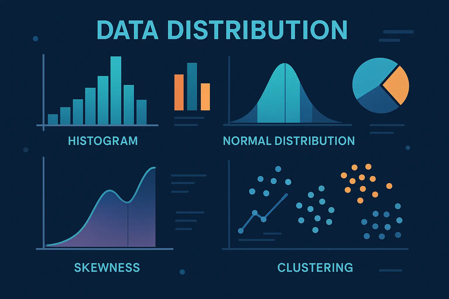
Histograms, Box Plots, and More
Graphs make the patterns in data distributions visible. A histogram, for example, is a straightforward way to see how often outcomes occur within certain ranges. Each bar shows the count or frequency of values falling within a specific interval, helping to reveal if your data is concentrated, spread out, or skewed.

Box plots, on the other hand, focus on the spread and outliers. A good box plot instantly shows if data tend toward the center, if there are long tails, or if outliers abound. For continuous distributions, violin plots give a richer picture by displaying the actual shape of the data’s spread alongside summary statistics.
Pie charts, stem-and-leaf plots, and scatter plots also have their place, especially for exploratory analysis. However, for clarity and deeper understanding, histograms and box plots remain the go-to tools for analysts working with distribution methods.
Tools for Efficient Visualization
Whether you’re making a quick chart for a meeting or conducting exploratory data analysis, digital tools make things simple. Excel and Google Sheets handle basic histograms and box plots with ease. Python enthusiasts turn to pandas and matplotlib, where a single line of code creates publication-ready visuals. For more interactivity, Plotly and Tableau let users explore data distributions dynamically, zooming into regions of interest or comparing groups side by side.
The choice of tool often depends on the data volume, the need for interactivity, and how you want to share findings. Some platforms excel at real-time, multi-user dashboards; others shine when automating large-scale batch analysis. Understanding your project’s needs helps pick the right fit.
Visualizing how data is distributed isn’t just about making pretty charts—it’s fundamental to recognizing hidden patterns, outliers, and potential pitfalls before diving deeper. With visualization mastered, the true value of data emerges as you put these insights into practice across different scenarios and industries.
Practical Applications
Business Analytics
Retailers use data distribution analysis to anticipate demand. By looking at sales data distributions across regions and seasons, companies can stock warehouses accurately and avoid costly overstock situations. A skewed distribution of purchase times, for instance, could reveal when promotional offers are most effective. Financial analysts rely on understanding the tails of distributions to assess risk and detect outlier transactions that might signal fraud or errors.
Database Sharding
Modern web platforms must cater to millions of users accessing data simultaneously. Sharding uses data distribution methods to split databases into manageable sections, reducing bottlenecks. For example, social networks might assign user data to different shards based on hashed user IDs or even by geographical zones. Proper distribution keeps queries efficient and prevents any single database from becoming a performance choke point.
Machine Learning and AI
In machine learning projects, recognizing data distribution shapes is critical. If training data is unevenly distributed—say, there are far more examples of one class than another—the model’s predictions can become biased. Techniques like upsampling or downsampling modify the data distribution to give models a fairer perspective. Understanding joint distributions helps algorithms grasp subtle relationships between variables, leading to better predictions.
With a sense of how distribution shapes day-to-day systems and decisions, it makes sense to explore how these patterns actually appear. The next section demonstrates how data distribution is made visible, helping both analysts and stakeholders interpret complex results at a glance.
Frequently Asked Questions
How do I tell which distribution my data follows?
Start with a visual check: plot your data as a histogram or a box plot and look for patterns. Do the values cluster around a central point (suggesting normal distribution) or are they heavily skewed? For a more precise approach, run a goodness-of-fit test like the Kolmogorov-Smirnov or Shapiro-Wilk. Many statistics libraries can automate this for you.
Why do distribution methods matter for performance?
The choice of distribution method controls how well your system spreads data across storage or processing nodes. If done poorly, you’ll see bottlenecks where a single server gets overwhelmed while others idle. Choosing the right method means smoother, faster queries and better scalability—vital for big data and concurrent environments.
When are mixed distributions used?
Mixed distributions make sense when your data comes from different sources or populations. For example, website traffic at midnight (few users) versus at noon (many users) could each follow separate distributions. In these cases, a single distribution won’t tell the whole story, so blended models capture the real-world complexity.
Now that you’ve got answers to the most common questions, let’s dive into how these distribution principles translate into industry applications—uncovering how data distribution shapes modern analytics, databases, and machine learning.