
Flexible Dashboards for Venture Capital Investors: Tools, Examples, and Best Practices
Making investment decisions in venture capital has always been a blend of sharp instinct and deep data analysis. But with VC deal activity reaching $170 billion in the US in 2023, the sheer volume and complexity of data are harder than ever to manage. That’s why flexible dashboards have become essential for investors—not just for tracking portfolio performance, but also for customizing insights, comparing deals, and reporting to stakeholders.
In this post, we’ll look at what “flexible” really means when it comes to dashboards for VCs, explore some of the most useful tools and features, and share practical examples you can learn from. Whether you’re a solo GP juggling early-stage bets or part of a large fund with hundreds of portfolio companies, the right dashboard can help you cut through the noise and focus on the signals that matter.
What Makes a Dashboard Flexible for Venture Capital?
Tailoring Insights to Investment Strategies
The most flexible dashboards do not force one-size-fits-all views. Instead, they allow each investor—or each team within a VC firm—to tailor dashboards around their specific investment style. A partner focused on early-stage SaaS companies, for instance, may want a different set of KPIs, visualizations, and cohort analysis tools than another who backs deep tech at growth stage. True flexibility comes from this ability to sort, group, and visualize data according to unique theses or mandates.
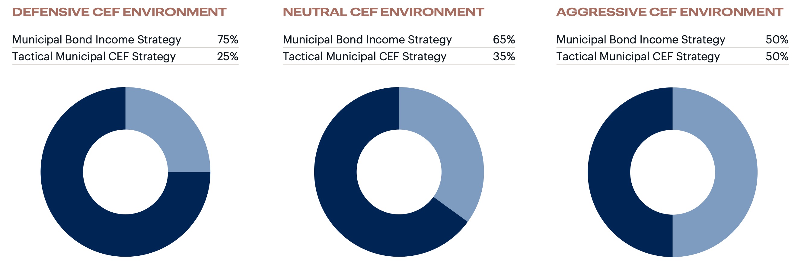
The example image above, with three contrasting pie charts, highlights how allocation models shift depending on economic outlook and risk profile—a perfect case for why dashboards should let users build their own lenses across various investing scenarios.
Real-Time Data and Dynamic Filtering
Investment landscapes change quickly and waiting for static, weekly exports is rarely enough. Flexible dashboards stand out by pulling in real-time portfolio updates, valuations, and fundraising data—then allowing users to filter it by sector, geography, vintage, or partner. Dynamic filtering makes it easy to quickly answer spontaneous questions, like finding all Series B investments in fintech from the last two quarters, or identifying warning signs across a sector under pressure.
Seamless Integration with VC Tools
No VC dashboard exists in isolation. The most useful ones sync effortlessly with deal flow platforms (like Affinity), financial tracking (QuickBooks, Carta), and communication tools (Slack, email). This means you get instant, organization-wide updates on company milestones or cap table changes without jumping between apps. Integrations keep data current and dashboards practical for daily decision-making, not just quarterly reviews.
Defining flexibility from these angles ensures every VC—whether a solo GP or an established fund—can build, adapt, and refine views around their exact needs. To see exactly which metrics benefit most from flexible dashboards, let’s dive into the key figures investors monitor every day.
Key Metrics VC Investors Track in Flexible Dashboards
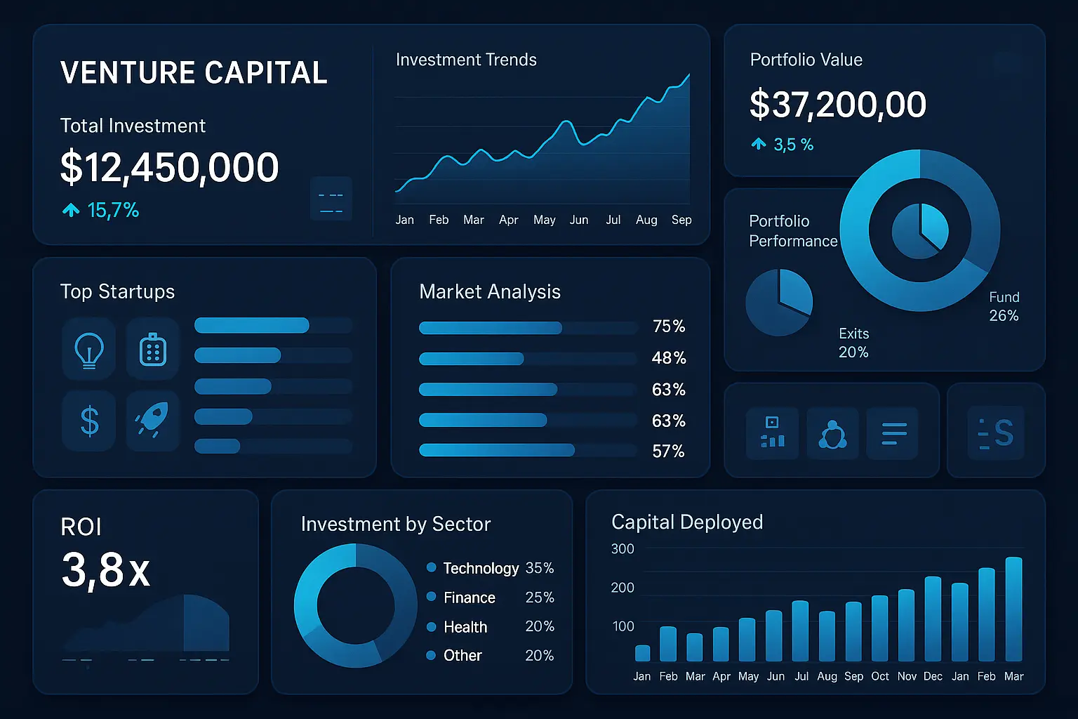
Portfolio Performance Overviews
The heart of any VC dashboard is the portfolio-level snapshot. This view puts IRR, TVPI, DPI, and unrealized gains front and center. Investors want immediate clarity on where the portfolio stands, which companies drive returns, and what’s underperforming. Visualization tools like sparklines and waterfall charts reveal trends over time, keeping it easy to separate signal from noise.
Deal Flow and Pipeline Analysis
Robust dashboards slice and dice deal flow by stage, sector, geography, and source. VC teams track how many conversations convert to term sheets or investments, pipeline bottlenecks, and which partners are uncovering the most compelling deals. Color-coded funnel charts and conversion rates make it easy to spot opportunities and gaps in sourcing.
Fund-level Returns and Benchmarking
Comparing fund performance against industry benchmarks helps VCs know if they’re outperforming or lagging, both at the fund and deal level. Dashboards overlay internal returns with Cambridge Associates, PitchBook, or custom benchmarks. Granular views allow a drill down by investment vintage or stage, revealing what’s driving above or below average outcomes.
Cross-Portfolio Comparisons
Flexible dashboards allow dynamic comparisons between portfolio companies on metrics like revenue growth, burn rate, runway, and follow-on rounds. Sorting and filtering functions let teams instantly see which companies are thriving, which require support, and where the next breakout may emerge.
While tracking these metrics provides vital visibility, the true strength of flexible dashboards comes from how they’re customized for each decision and audience. In the following section, we’ll look at how VC teams tailor dashboards to support both internal reviews and communication with external stakeholders.
Dashboards for Internal Reviews vs. LP Reporting
Custom Views for Investment Committee Meetings
When preparing for internal reviews, dashboards become a control center for investment teams. The emphasis is on clarity and speed: partners want to see portfolio company status, flagged risks, capital calls, recent deal flow, and how these align with fund objectives—all on one screen. Filters allow quick toggling between individual companies, sector trends, or investment stages, supporting nimble decision-making during committee discussions.
Preparing Snapshot Reports for LPs
Limited partners (LPs) expect concise, high-level insights supported by solid data. Flexible dashboards can generate snapshot reports that distill fund performance, write-ups on new investments, and capital account summaries. Custom branding and annotation tools help frame these updates so LPs see not just the numbers, but the story behind them—without exposing operational details that are only relevant internally.
Sharing Securely with Stakeholders
Sharing data safely is critical, especially when confidentiality agreements are in play. The best dashboards offer permission-based sharing so each audience—the investment committee, LPs, or external auditors—sees only what’s appropriate. Features such as watermarking, view-tracking, and expiration controls add extra layers of security, ensuring sensitive pipeline and performance data doesn’t leak beyond its intended audience.
With these differences in mind, the real edge comes from dashboards designed to pivot between these audiences in just a few clicks. But how do these internal and external views actually look in practice? Let’s explore some real examples that showcase this dual flexibility.
Practical Examples: Flexible VC Dashboard Setups
Interactive Models for Scenario Analysis
Imagine you’re prepping for a partner meeting and want to run multiple what-if scenarios—instantly adjusting expected exit multiples, runway assumptions, or follow-on investment rounds. A flexible dashboard should let you manipulate sliders or input assumptions, with real-time changes propagating through your charts. One VC firm built a dashboard with interactive toggles for macroeconomic variables, which helped reveal portfolio sensitivities in seconds. It didn’t just save time; it revealed new risks previously hidden in static spreadsheets.
Tracking Exit Timelines and Valuations
Tracking potential exit windows and shifts in portfolio company valuations is central to venture analysis. A dynamic dashboard might include a timeline visualization, where each portfolio company is mapped against projected exit quarters and valuation bands. For example, a timeline view shows color-coded bars for each startup, indicating current fair value and projected exit value. This allows investors to spot clusters—perhaps too many exits expected in a single year—and re-balance risk.
Diversity and ESG Metrics in VC Portfolios
Modern dashboards go far beyond financials. One progressive example tracks founder gender, ethnicity, ESG scores, and geographic outreach, updating as new deals close. Filters allow slicing data by sector or stage, helping VC firms spot gaps and measure progress over time. For instance, flagging a dip in portfolio diversity can trigger focused sourcing efforts in the next investment cycle.
The best flexible dashboards aren’t just collections of charts; they’re living tools that spark insight and action. Now, if you’re inspired to build your own version, you’ll want to consider which features are non-negotiable, what platforms play well with your data sources, and how to keep everything humming as your portfolio grows.
Getting Started: Building Your Own Flexible VC Dashboard
Choosing the Right Dashboard Platform
Your dashboard is only as good as the foundation you lay. Popular choices like Tableau, Microsoft Power BI, and custom solutions built atop Google Data Studio offer a range of control, but the best choice comes down to your team’s technical comfort, budget, and existing stack. If you’re seeking customizability, a platform with powerful API integrations will better aggregate deal data, cap tables, and market signals. For plug-and-play simplicity, off-the-shelf VC-focused SaaS options streamline setup, but may trade off some flexibility.
Must-Have Features for Venture Capital Use Cases
Don’t just pull in numbers—build a dashboard that slices your portfolio by sector, stage, and geography. Make sure it can display deal flow pipelines, visualize historical IRRs, and flag capital calls or exits. Interactive filtering enables real-time scenario testing, such as instantly comparing early-stage against growth-stage performance. Above all, ensure your dashboard quickly surfaces exceptions—outliers in cash burn, delayed milestones, or sudden swings in valuation.
Tips for Clean Data and Automation
Automating data ingestion saves you from late nights fiddling with spreadsheets. Connect directly to your most-used sources: CRM, accounting software, cap table management, and public APIs for market data. Always standardize formats—especially dates and currencies—up front. Build in alerts for missing or mismatched data; today’s oversight becomes tomorrow’s headache if left undetected. Schedule ETL (extract-transform-load) processes so portfolio updates arrive automatically, freeing you to focus on insights instead of clerical upkeep.
This foundation will help you craft a dashboard that doesn’t just display numbers, but truly sharpens your investment edge. Now, let’s look at how leading VCs are turning these setups into tangible results with hands-on examples and best practices.
Frequently Asked Questions
Can flexible dashboards adapt to different VC investment stages?
Absolutely. Dashboards built for venture capital should morph along with your investment focus—seed, Series A, or growth. You can swap out metrics, change filters, and refocus visualizations to match each fund’s priorities. For example, at the seed stage, dashboards might highlight run rate and founder updates, but by Series B, they can emphasize revenue growth and operational KPIs.
How secure is portfolio data in these dashboards?
Data privacy is fundamental. Most dashboard platforms offer bank-level encryption, two-factor authentication, and fine-tuned permissions. It’s wise to select a tool that logs user activity and allows single sign-on via your identity provider so you can control who views or edits sensitive details about investments and valuations.
Recommended integrations with existing VC systems
Smooth dashboard experiences depend on effortless data flow. Look for integrations with your CRM (like Affinity or Salesforce), cap table solutions (such as Carta), financial data sources (QuickBooks, Xero), and document storage (Dropbox, Google Drive). Native connectors save your team time, while API support ensures flexibility if you need custom workflows.
Now that your most common questions are answered, let’s explore some practical strategies to make flexible dashboards a functional part of your investment process.